About the Project
Problem Statement Overview
Hash Store is a mobile app that primarily sells technology accessories.
The interviewer provided the Problem statement. It was a small scenario for purchasing computer accessories online with a straightforward payment method.
Problem Statement Overview
This mobile application is a prototype for an interview task. We are working together to create this application. Prepare for the journey and jump in!
Our End Goal
Providing a clean, simple, and easy checkout experience for a user to get a camera setup for videos and meetings.
UX Process
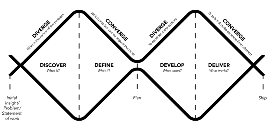
To solve such a problem, I used the Double Diamond model. I prefer to do some preliminary research on the various processes and then select the one that I believe best fits the situation.
1. DISCOVER
Because time was limited in the first phase, I chose Secondary Search as my research method. So I did some research on the internet about problems that users face at checkout and some real reviews on various apps that focus on the checkout process.
Problems Summary
1- Issues with Account Creation Wizards for creating complex passwords.
2- Inadequate shipping information, with no clear delivery options.
3- Inadequate credit card field implementation.
4- Cannot edit order from Order review and must start over.
5- Retrying the checkout process if an error occurs.
6- The checkout process is very long and complicated.7- Users may be concerned about the security of their credit or debit cards.
8- Additional Hidden Fees at Checkout
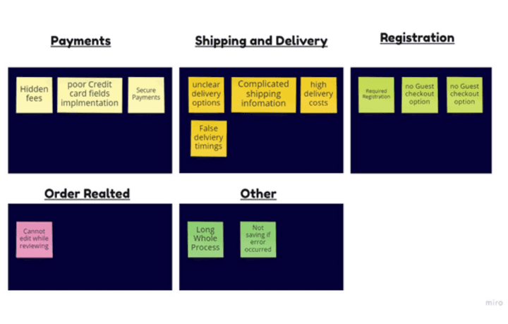
ِِAffinity map
I used the Affinity Map to cluster similar problems together, Prioritizing the problem according to my task needs I decided to focus on the Payments Section problem.
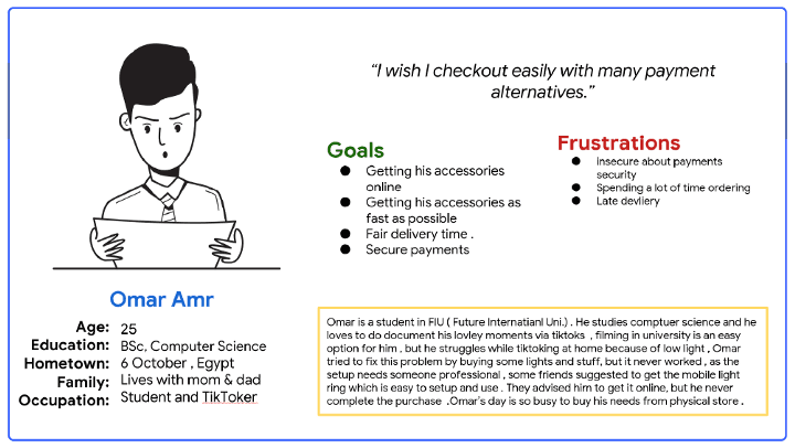
User personas
I formed one user persona, and I usually try to make the persona as real as possible by including as many details as possible that will aid me in the process of solving the problem. I also try to include some details to build a narrative story, such as the - insights I gained from the interviews or the actual interviews.
Creating a User-story based on the persona
As a TikTok user, I want to order mobile accessories with different payment methods So That I can shoot TikTok videos in my free time.
3-Develop
Information Architecture
The following information architecture is built using the insights gained from the previous stages. I tried to make the checkout process as simple as possible.
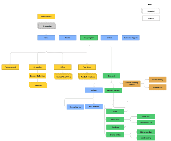
User flow
After creating the IA, I created the User flow for checking out a product. User flow could reveal any of the missing parts of the user journey . You can check it out Here.
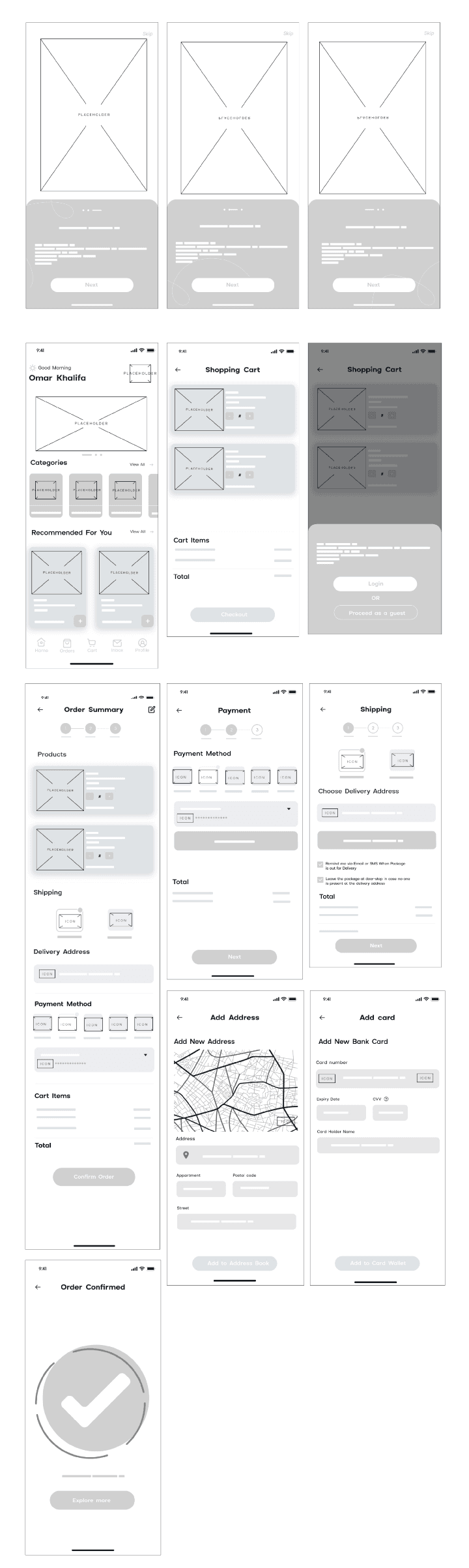
Digital Wireframes
I started with digital wireframes as my first step, I made a few sketches on paper after that I digitized them ( My sketches were very quick ones due to the task deadline ).
4-Deliver
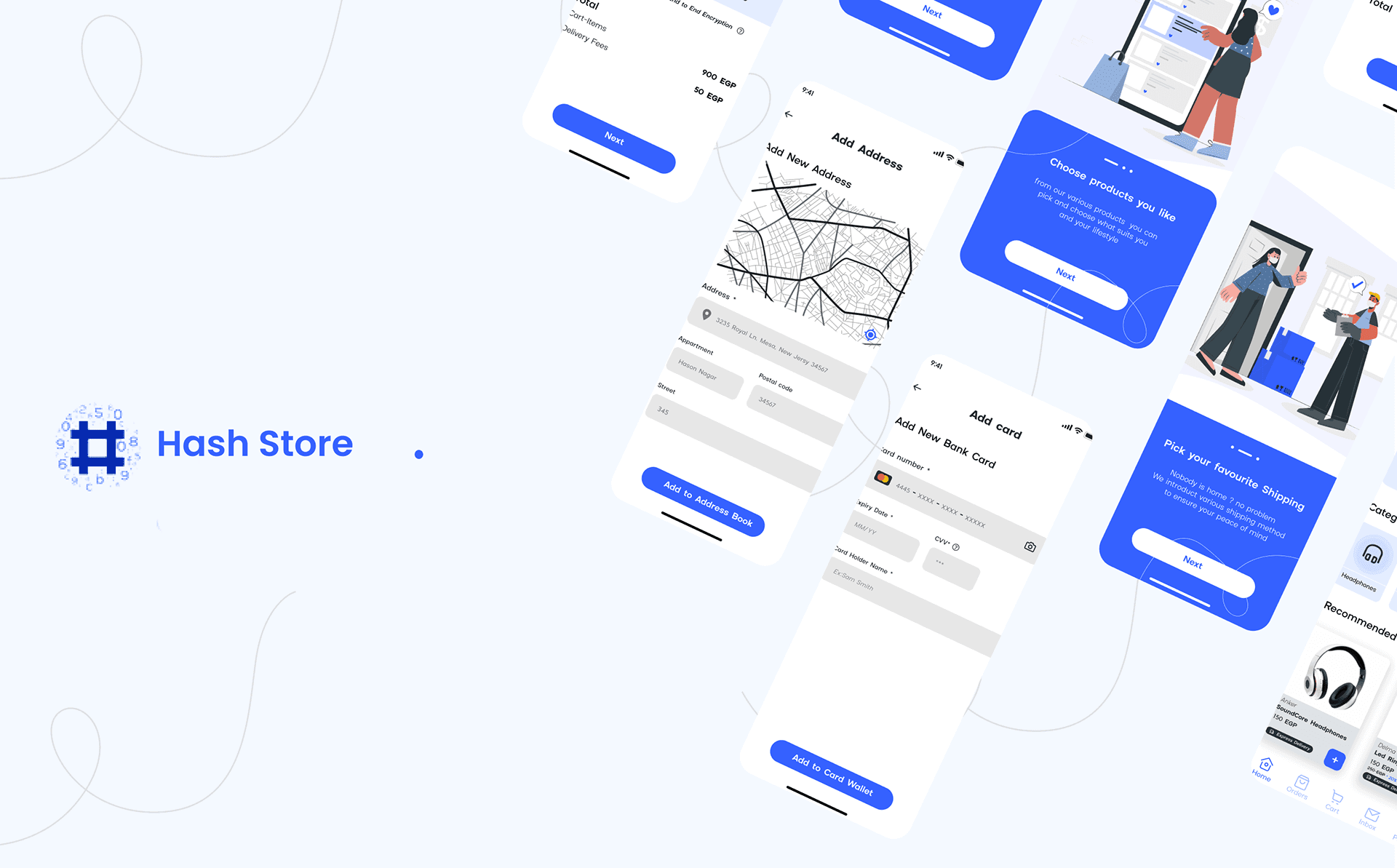
Hi-Fi Wireframes
Onboarding
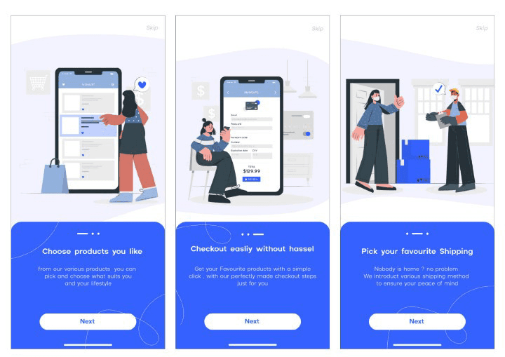
The first screens I came up with are the Onboarding screens, most of the time I highlight the top features on the onboarding along with 3-step illustrations for the app
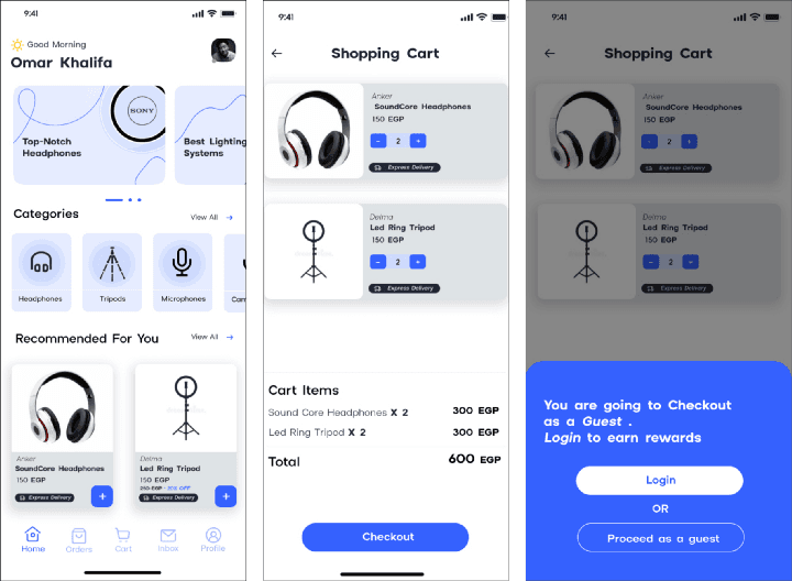
Home Screen + Shopping Cart
Moving to the next screens, we have the Home screen which has come moving carousel banners, after the Categories section followed by the Recommendations section.
After adding any product, the items you chose will be available in your shopping cart with a cost breakdown for each item.
Proceeding with your shopping cart will ask you if you want to continue as a guest or to log in.
I accompanied the login action with rewards as an incentive, but the user has the freedom either to log in or to continue as a guest.
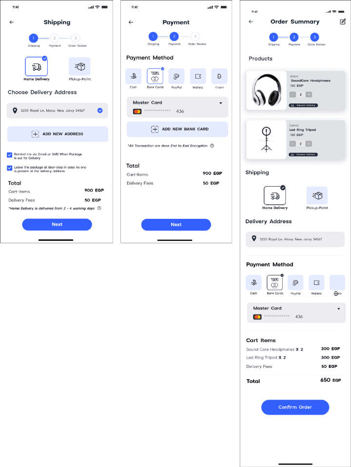
Checkout & Payment Walkthrough
The Checking out walkthrough starts by choosing the shipping method either to get the item by delivery or to pick it up after that add an address, there are two checkboxes that indicate to leave by the door option and to be notified when the package is out for delivery.
After that, we head to the payment methods. Multiple options were added to help users choose from. Options like Cash, Bank cards, PayPal, E-wallets, and Crypto.
The Third and final step is a review of the order to check everything is Okay before confirmation.
Usability Testing
A Moderated Usability testing was made with a set of given tasks based on the Research plan can be summarized as follow:
1- Research Goals: To find out what of our new features made it easier to checkout easily and discover new opportunities.
2- Methodology: Remote Moderated Study.
3- KPIs: Time Taken to checkout, Rate of drop-offs, Cart Abandonment rates.
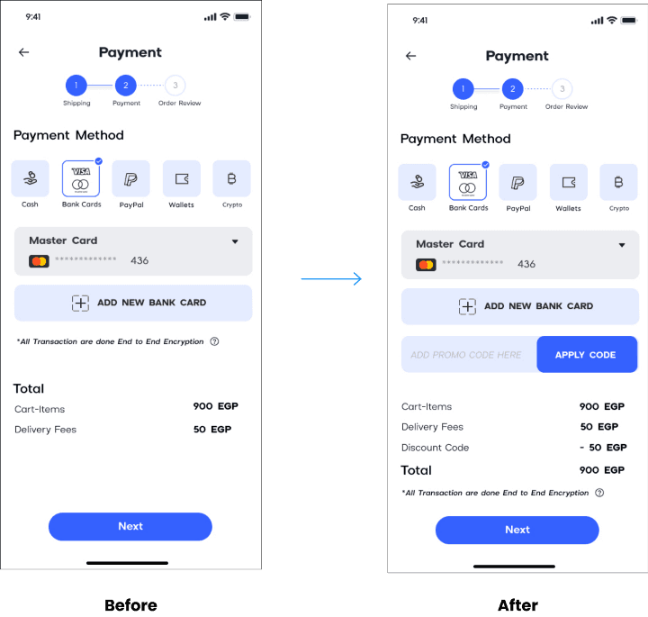
4- Findings: No Language change, No place for applying discounts.
Iteration #1 Enhancements
I Made One simple change in the payment screen which is adding " Promo code " Field the screen
Complete prototype
The screens above are the main screens only there are some complementary screens in Figma prototype Here.
Takeaways & What I learnt
1- Based on the feedback of the interviewer, He told me that there is no default state for payment options, and I got asked how that will help the business — the company product was a crypto payment gateway API.
Making users pay through their payment gateway should be prioritized which I didn't put in consideration.
2- During the first iteration, I realized I kept drifting away from the user's main goals and getting too broad leaving their needs behind, So it is important to Re-check user goals and keep them Infront of your eyes all the time — Aligning them with the business goals of course —
3- I did some research about colors and the style guide before starting, aligning the colors according to the color theory, I should have spent more time researching the colors.